Replicating 20 years of index performance to understand what weighting methodology actually does to your returns.
Most investors interact with indices as black boxes. You buy SPY, you get “the market.” But what does that actually mean? How much does the weighting methodology matter? And what happens when you strip away survivorship bias?
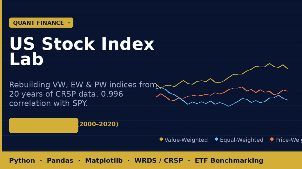
I decided to find out — by building three versions of a Top-500 US equity index from scratch using two decades of raw CRSP data.
The Setup
Using monthly stock data from the WRDS/CRSP database spanning 2000 to 2020, I pulled price, return, and shares outstanding for every US common stock listed on the NYSE, AMEX, and NASDAQ. Then I built three distinct indices, each holding the top 500 stocks by market cap, rebalanced monthly.
Three indices. Three philosophies. Twenty years of data. Let’s see what happens.
The Hidden Problem: Survivorship Bias
Before building anything, there’s a data quality problem most people ignore.
If you only analyze stocks that exist today, you’re unconsciously selecting winners. The companies that went bankrupt, got delisted, or were acquired are gone from your dataset — and their losses are gone too. This makes historical performance look artificially good.
The fix: merge the main stock file with CRSP’s delisting returns file to capture what actually happened when stocks left the index. This creates an “effective return” that reflects the full picture, including the ugly parts.
This single step is the difference between an honest backtest and a fantasy.
Three Indices, Three Philosophies
Value-Weighted (VW) — The S&P 500 Analog
Each stock’s weight is proportional to its market capitalization. Apple gets more weight than a $2B regional bank. This is how the S&P 500 works — and it means your portfolio is inherently momentum-tilted. Winners grow their weight; losers shrink.
Equal-Weighted (EW) — Democratic Allocation
Every one of the 500 stocks gets exactly 0.2% of the portfolio. No single company dominates. This sounds fair, but it means monthly rebalancing constantly sells winners and buys laggards — a built-in contrarian tilt.
Price-Weighted (PW) — The Dow Jones Analog
Weight is determined by share price, not company size. A $500 stock gets 5× the weight of a $100 stock, regardless of which company is actually larger. This is the methodology behind the Dow Jones Industrial Average — and yes, it’s as arbitrary as it sounds.
Benchmarking Against Reality
Each custom index was plotted against real-world ETFs:
- SPY — SPDR S&P 500 ETF (benchmark for VW)
- IWM — iShares Russell 2000 (benchmark for EW, given its small-cap tilt)
- QQQ — Invesco Nasdaq-100 (tech-heavy benchmark)
The validation result that stood out most: the custom Value-Weighted index achieved a 0.996 correlation with SPY over 20 years. That’s not a coincidence — it’s confirmation that the methodology was implemented correctly.
What the Correlation Matrix Reveals
The final analysis compares all three custom indices and the benchmark ETFs in a single correlation matrix. A few findings worth noting:
- VW and EW diverge significantly over time, especially during momentum-driven bull markets where mega-caps dominate
- PW introduces the most idiosyncratic noise — arbitrary weighting creates drift that neither size nor momentum explains cleanly
- All three indices outperform M1 during specific regimes, suggesting methodology timing matters more than most passive investors realize
Why This Project Matters Beyond the Numbers
Building an index from scratch forces you to confront questions that ETF marketing materials never ask:
- What exactly are you owning when you buy “the market”?
- How much of your return is methodology, and how much is the underlying economy?
- What would your returns have looked like if you’d equally weighted everything — and rebalanced monthly?
The answers are in the data. Twenty years, 500 stocks, three methodologies — and a reminder that every index is a choice.